I cringe 😬 at the thought of "scaling" education because it implies that teaching is simple enough to be automated. "Scaling" education usually means creating a static repeatable learning experience while increasing the student to teacher ratio. Teachers are never excited at the idea of having more students with the same amount of resources. "Scaling" education makes teaching feel too easy, too impersonal, and too transactional 💸. "Scaling" typically removes the ability to personalize each individual's experience.
Recently, instead of viewing scale as the enemy 😈, I've started to think about scale as a way to invest more time in creating more personalized learning experiences. If we discover and address common gaps in student understanding early, we can spend our time developing individual student styles. Instead of repeating the same feedback over and over again, we can spend our time doing the fun things 🎉
At Lambda, with over 100 design students, we need to develop systems that scale. 100 might not seem like much in comparison to UC Berkeley's intro to computer science class with 1000+ students, but it's not possible to auto-grade design assignments.
Receiving ✨individual feedback ✨ is crucial to improving your design process and craft. In an ideal world, the design team would all have time turners 🕰, but since we're Muggles, we've developed some strategies for scaling feedback instead.
📝 Written interview prep
We don't have the time to do 30-minute practice interviews with every student regularly, so we do some interview prep with Google Forms 📝! (Outside of time constraints, it's also impossible to stay alert 😳 if you do more than two mock interviews back-to-back!) Recently, we sent the following questions to the students. We wanted each prompt to assess critical thinking and design reasoning skills.
- 💬 Describe your design process.
- 🍎 You're presented with a project to "Improve grocery store lines." What's your first move?
- 🎨 Define visual hierarchy.
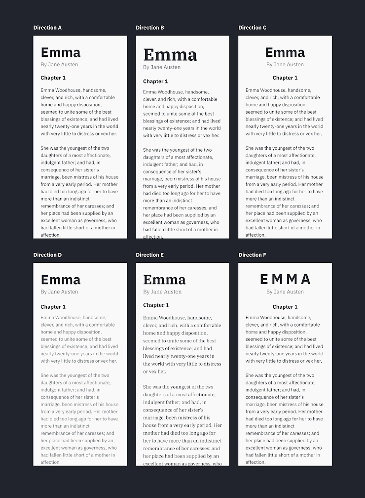
- 📝 Which type hierarchy do you feel is better and why? This one deliberately does not have a clear right answer 😉. I'm curious which one you all feel is better!
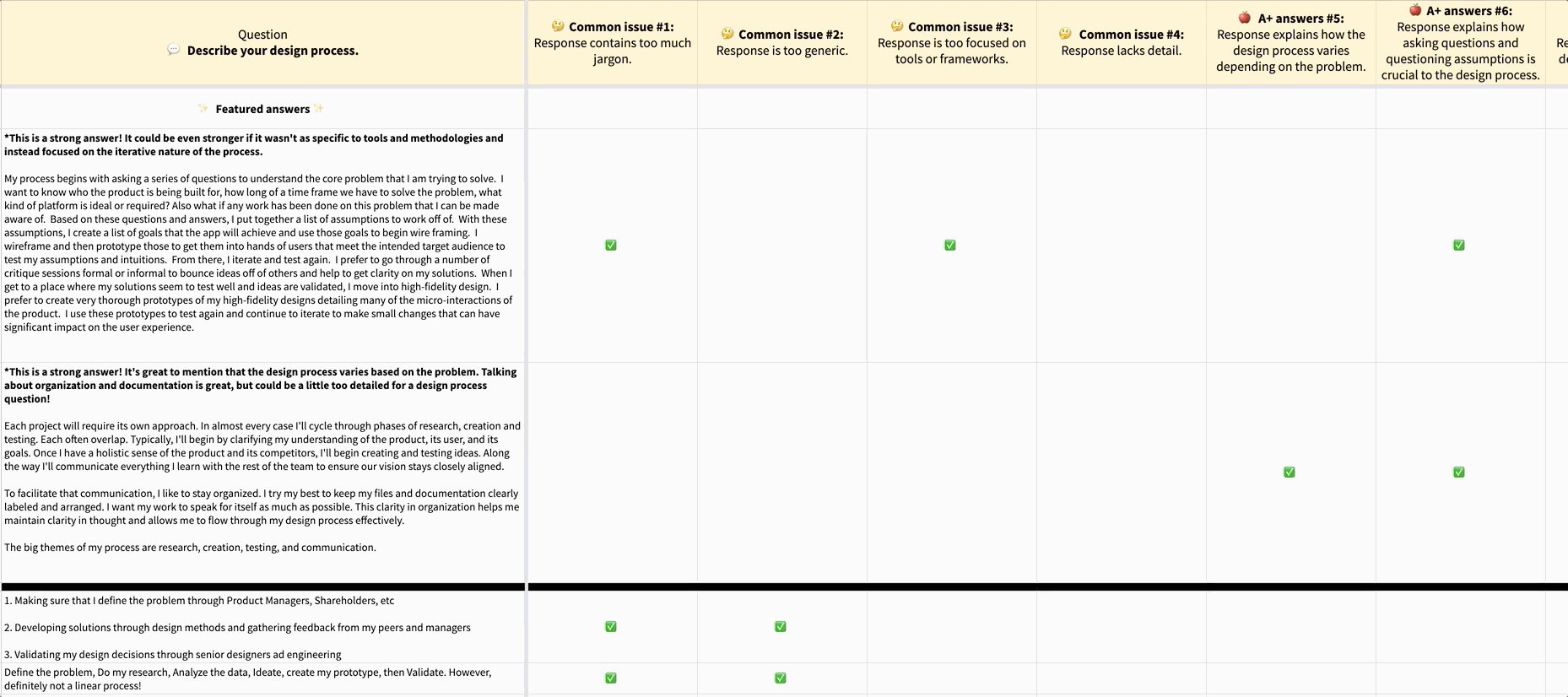
We received 72 student responses! (If we had done 30-minute 1-1 interviews, it would have taken 102 hours 😱.) It took us around 2 hours to scan through every response and develop themes. What are the common issues across their responses? How are the best answers similar? For "Describe your design process," we noticed that most student responses were generic, while the best answers provided an example of a specific project. 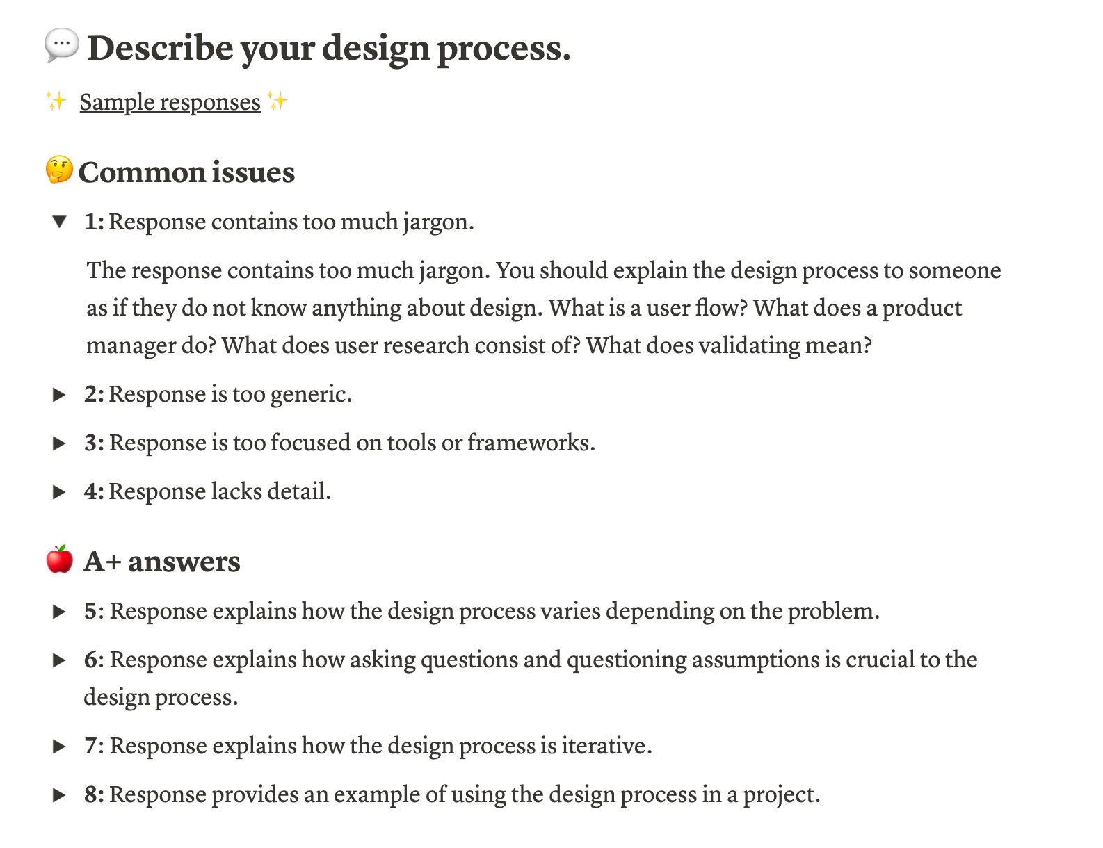
We also shared every response anonymously and assessed ✅ each one with the themes. We hope to use the themes as a rubric for future students!
I also believe that writing down responses to common interview questions helps you clarify your thoughts and ideas.
✅ Checklists
Learning to self assess your work is crucial to becoming a designer. At Lambda, we realized we were spending too much time giving the same nit feedback. The nits and details are so important for improving your craft. When I started at Khan Academy fresh out of college, I was lucky to be surrounded by mentors. Their detailed feedback guided me to become a stronger designer in process and craft ✨. I will never forget to use sentence case again.
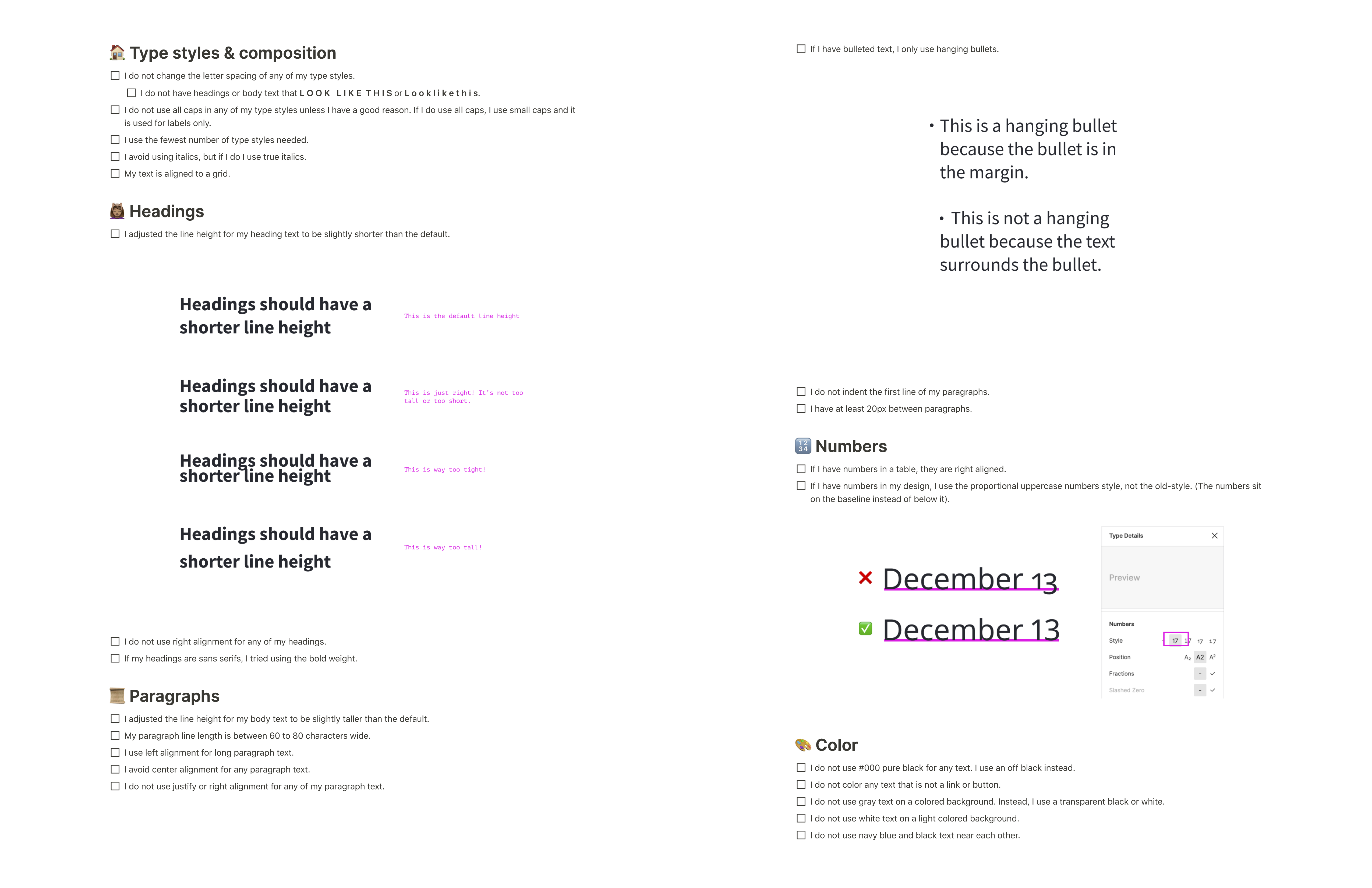
Typography is the most challenging visual design element to master, so we developed a checklist that calls out common issues we see in student work. With these checklists, we're explicit that they're just a guide. Rules are meant to be broken, but these rules are great guard rails if you're just getting started 🚧.
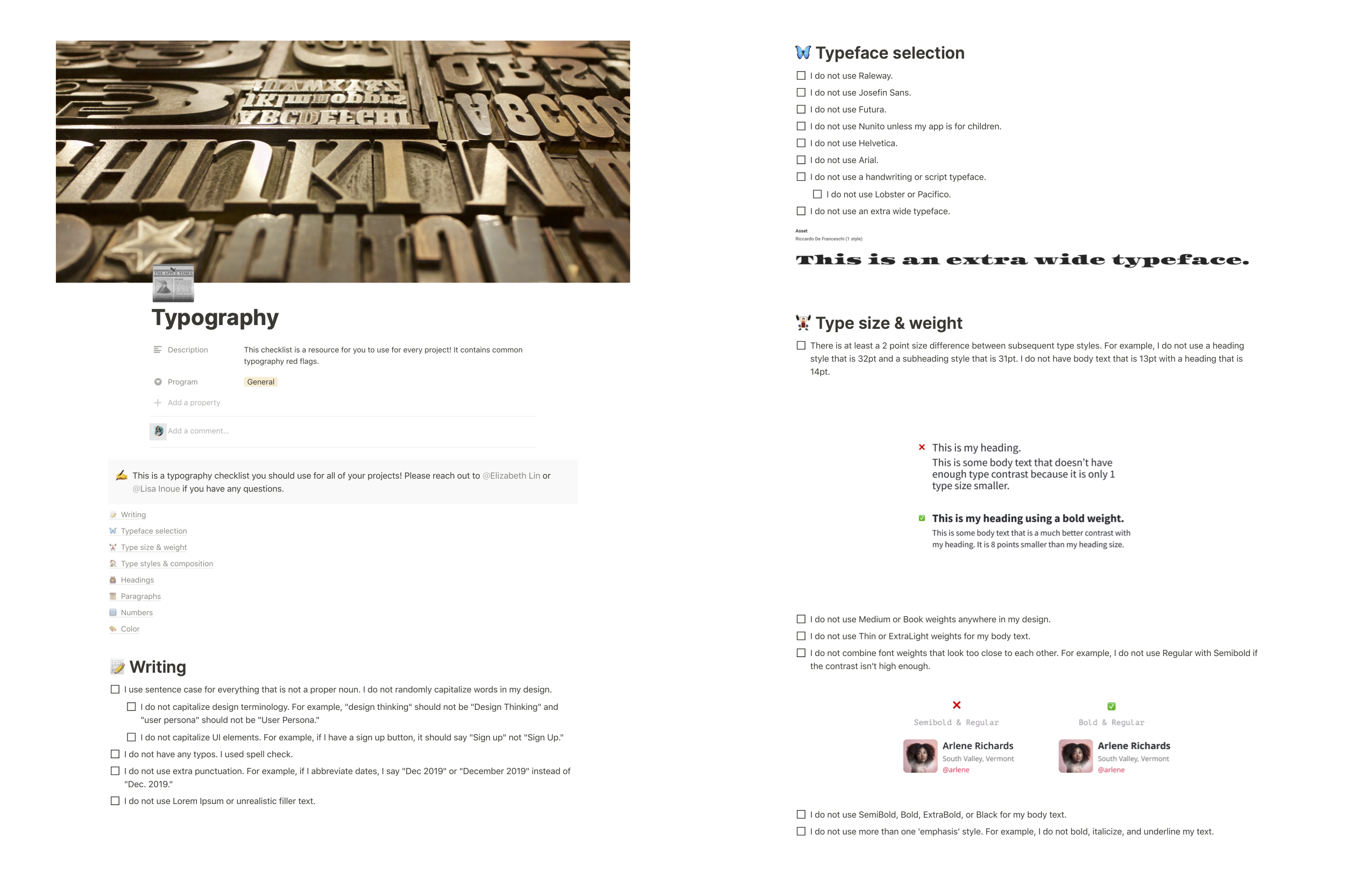
In the checklist, we list a set of typefaces to avoid 🙅🏻♀️. I totally get some of those choices might be controversial in the design industry, but there's something about Raleway that magically makes any project look like student work.
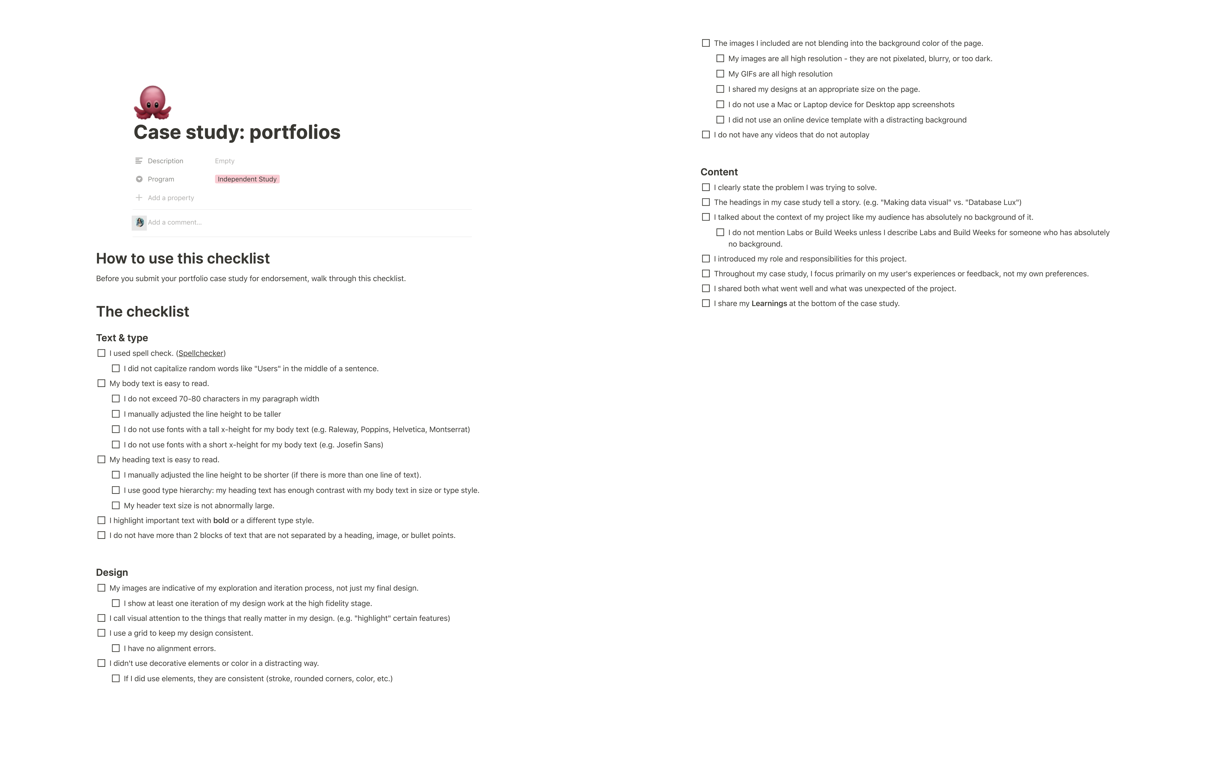
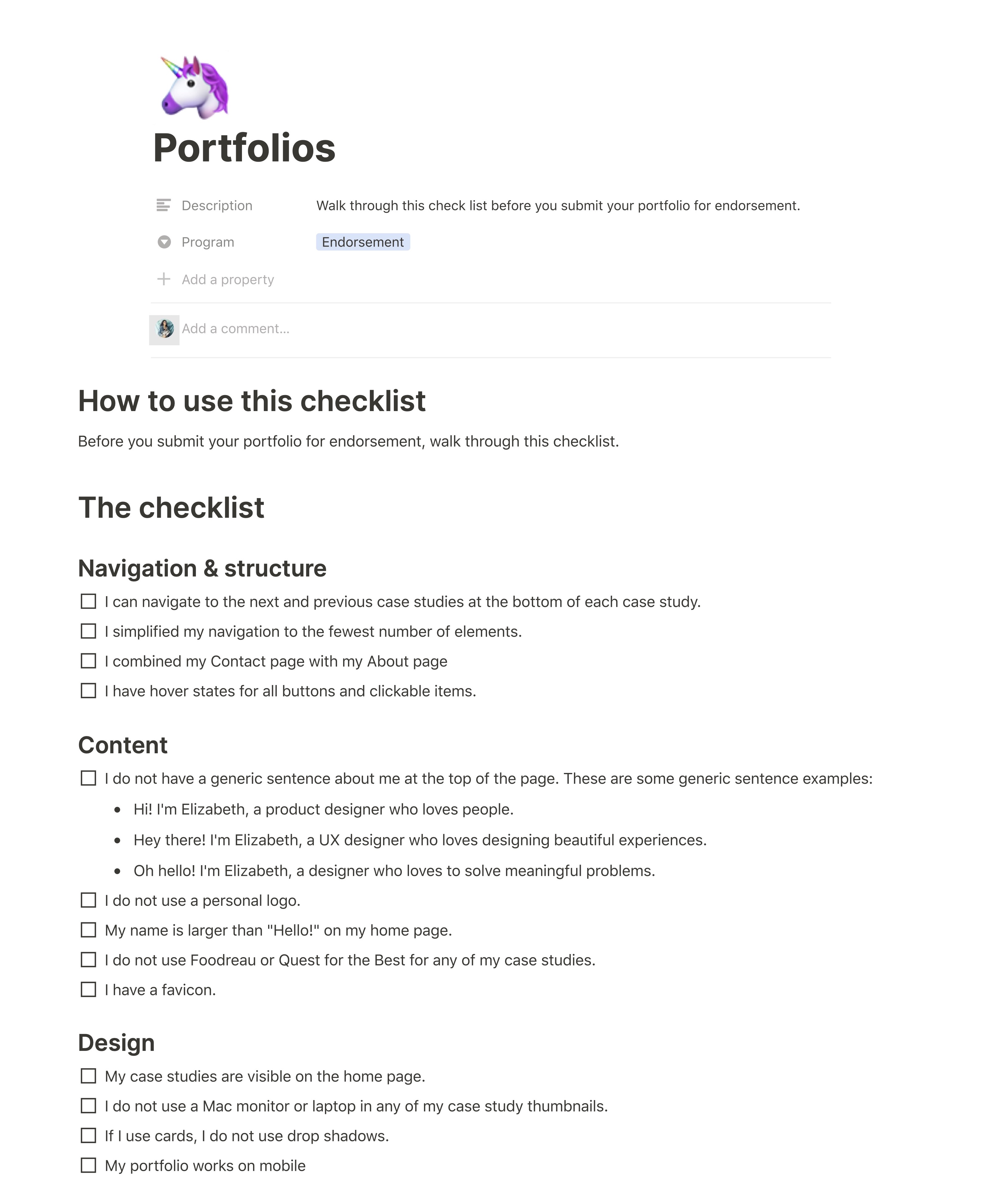
We also created checklists for portfolios, case studies, and resumes! I hope each one of your pet peeves is on there 🤓. We designed these checklists based on our past experiences and interviews with designers.
📓 Visual design rulebooks
Sometimes, we notice misconceptions in student work that we cannot resolve with just a single line of feedback. We need to showcase the deeper why with visuals. Based on their common misconceptions, I create and post a relevant visual design tip in Slack. These are some of my favorites 🌟.
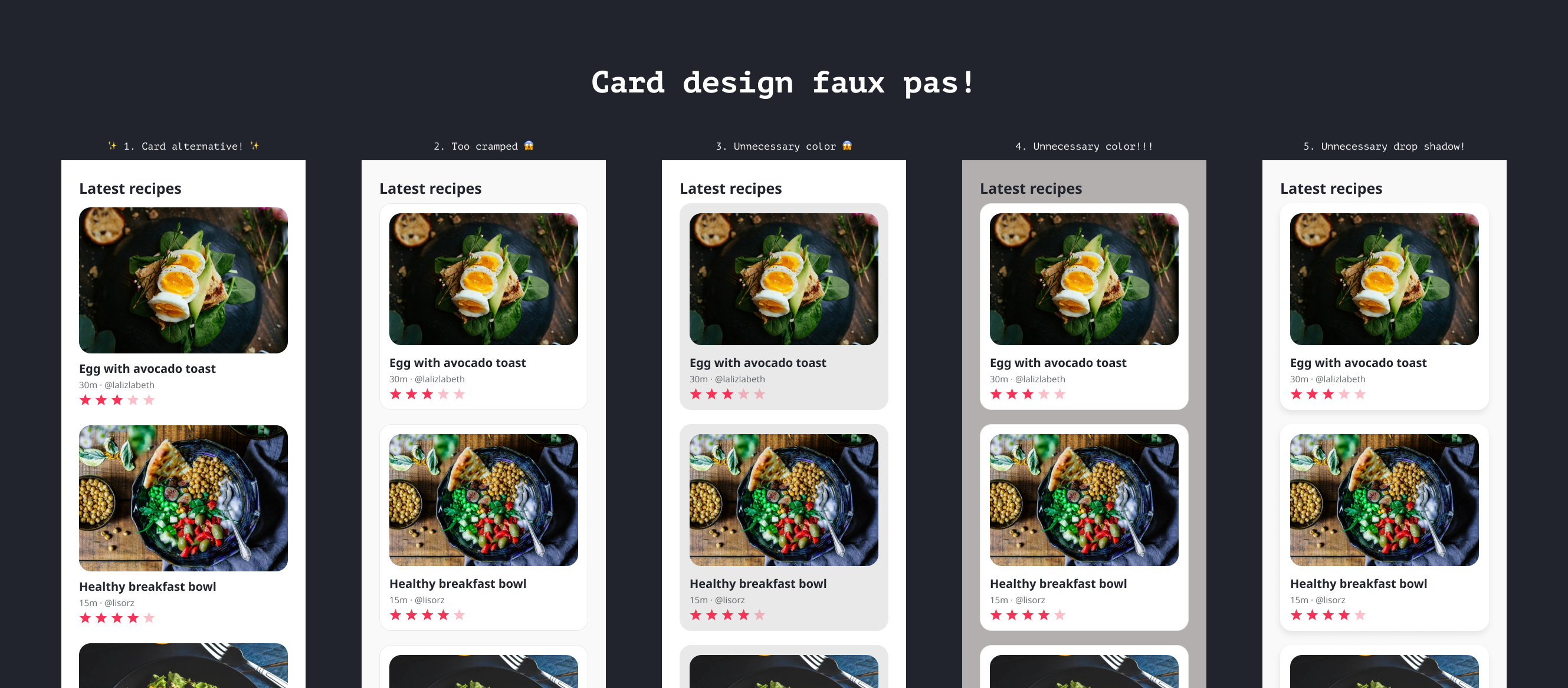
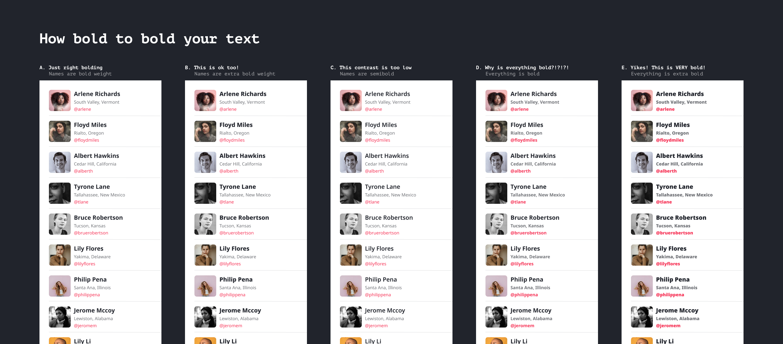
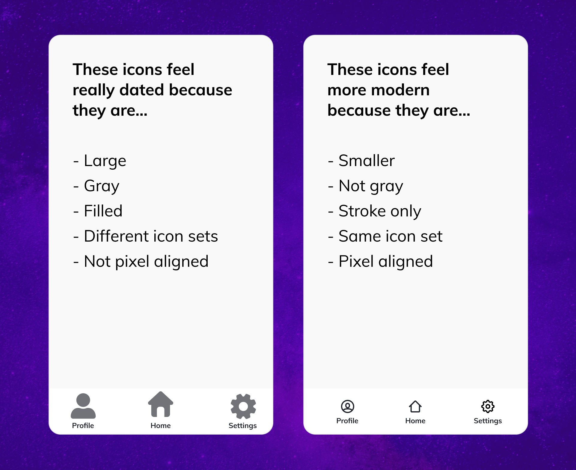
Now, these tips and tricks are a resource for us to use! For example, if we see a student who uses excess tan, in their UI, we can just send this to them:
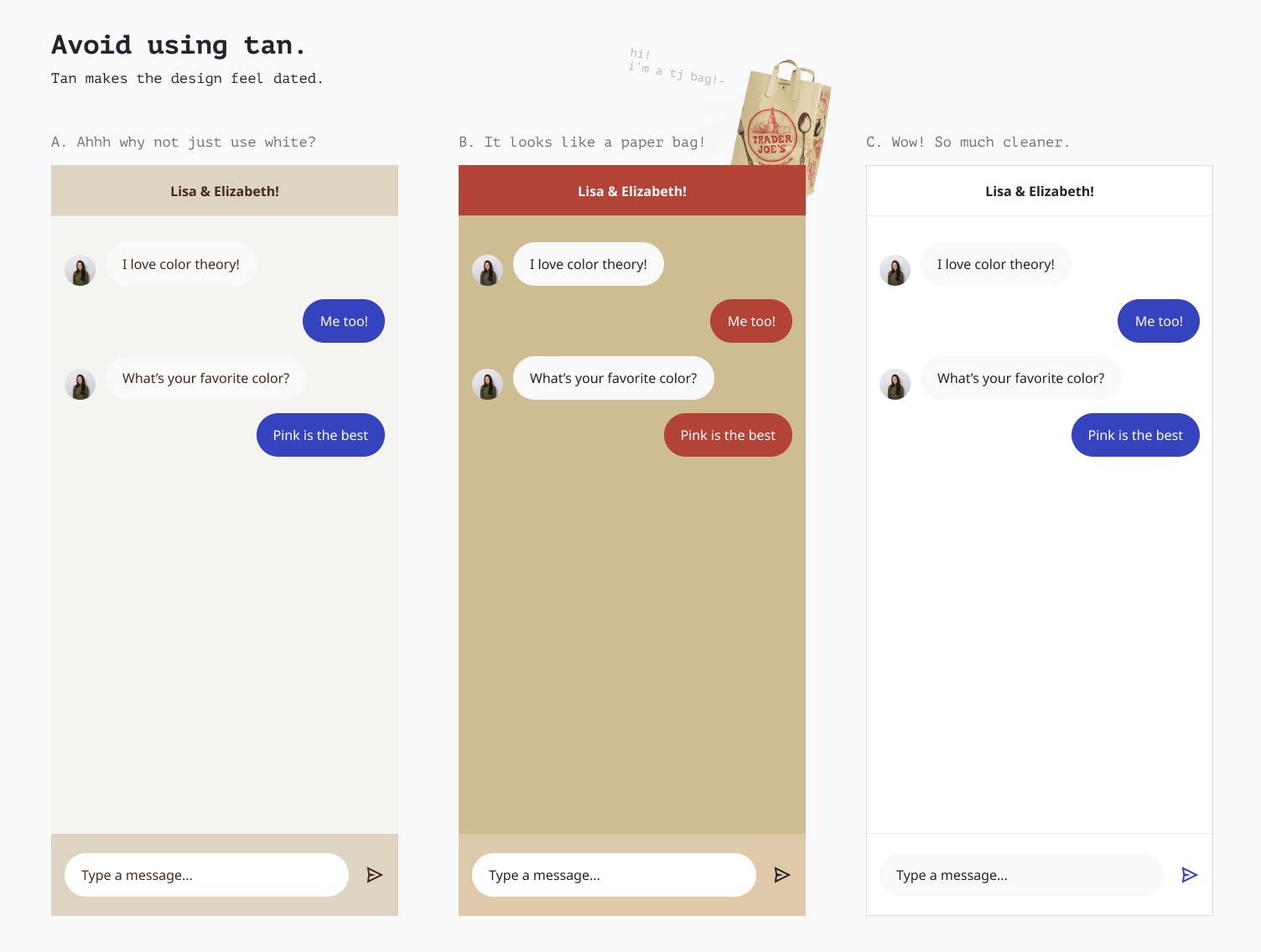
I know tan is having a brand moment, but it's so tricky to pull off 🙈.
We've also joked about making a Figma plugin that prompts students to explain why when they break one of our suggested rules. For example, if a student tries adding a drop shadow to a modal, they would be prompted with:
“👋 Why are you adding a drop shadow? Have you considered using a dark overlay instead?"
🤔 How do you think about scaling feedback?
Thinking about scale challenges me to find the deeper roots 🌳 of the problem. Why do we frequently see the same mistakes over and over again? What's broken with our curriculum? How can we address this misconception with every student at once? If one student is struggling with this, are other students struggling as well?
Jump into this Figma file to participate in an interview prep activity! I'm going to write a follow-up post about how we provide feedback and run critiques ✨