who defines good taste?
May 08, 2020
Shield your eyes 🙈. I want to share some snapshots of my “designs” from high school.


😱 Yikes! Looking back, I wonder why I ever thought these looked “good.” One of my favorite fonts at the time was literally 🗑 Trash Co. (I would browse Dafont at least 3 times a day looking for title fonts for my school essays.)

Ok, shield your eyes again 🙈. I want to share two of my first UI projects. You’re about to see Lobster 🦞 and some very circular buttons. It looks like I frankensteined together 10000 visual styles from CSS Tricks.


In all these past projects, I was just making stuff for fun. I didn’t even know rules 📜 existed. For one, I was not familiar with Apple design standards. In college, I was on a PC until my sophomore year and didn’t have a smartphone until my junior year. (Yes, I used to print out maps to get places 🗺)
I like to share my old work because people think you’re born with “good taste.” However, both my work and “good taste” has evolved. My work evolved because I was exposed to more design, more art, and more internet 💻. Take a look at the evolution of my portfolio (from 2012-now):


Looking at these screenshots, some aspects of my personal style never change ✨. I’ve just continued to refine what my personal style is. (Also, if you’re interested, my sfpc project critiqued our perception of taste: what do we perceive as beautiful?)
🕰 Starting with the history
As a design educator, one of my biggest challenges has been developing student taste. I’ve spent a lot of time reflecting on how I developed my style 👠. Who defines good taste? Why is having good taste important? How has the definition of good taste evolved? What is the difference between good taste and good visual design? And, what about styles like brutalism that seem to throw everything out the window?
“Good taste” matters a lot if you want to land any product design role today. If your design work looks dated, you could get rejected on the spot. Unfortunately, “good taste” is defined by designers in the industry, and there is no secret checklist to achieve it. “Good taste” is subjective, but the industry tends to have the same definition of what “good” is 🧐.
In a recent lesson, I tackled the history of graphical user interface aesthetics head-on. To prepare, my team mapped out a brief history of user interfaces. (We definitely missed lots of things, but thank god Neopets 🌈 made it in there!) I wanted to focus on finding the source of common style faux pas we see in student work.
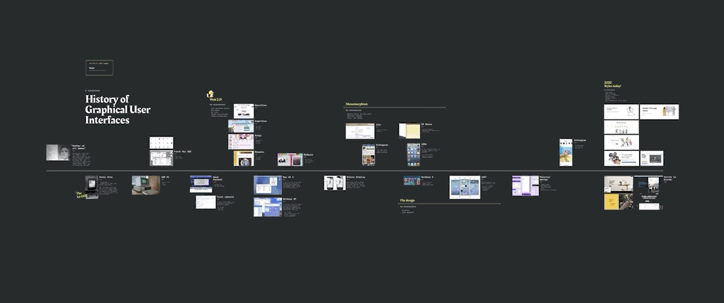
During the class, I walked through the timeline and explained characteristics of each era. My goal was to showcase the WHYs of modern taste. I know some of these rules might be controversial, but I think they’re good training wheels for new designers 🚲
- Why do harsh drop shadows feel dated? Look at the app icons in iOS6 from 2012. There are massive shadows behind every icon. 😱 2012 was 8 years ago! Yes, Material Design uses harsh drop shadows too, but that’s their unique characteristic. Products today that use drop shadows do it so subtly that you don’t even notice them.
- Why do thin fonts feel dated? iOS7 introduced thin fonts in 2013. I actually remember the day iOS7 was launched because the design team at LinkedIn was freaking out both positively and negatively 🥴. I definitely had my own thin font phase, but now I think they’re incredibly difficult to read 🔍
- Why can gradients feel dated? Similarly to thin fonts, iOS7 introduced bright color gradients. I see many entry-level designers use these 🌅 gradients, especially in buttons and cards! If you look at products today, they usually incorporate gradients very subtly! For example, look at Instagram’s chat interface or story rings.
- Why should you stop using Helvetica? iOS started using SF Pro instead of Helvetica in 2015! I think there’s a misconception that Helvetica is still the most classic typeface for UI. I think there are plenty of newer typefaces that increase readability for large bodies of text.
- What styles are popular 💁🏻♀️now? I took screenshots of landing pages and described the themes across them. Many companies use a large serif heading on a plain background accompanied with an illustration. The illustrations incorporate texture strokes, collages elements, and blobby people (does this style have a real name?).
I also walked through logo rebrands from popular tech companies to showcase the convergence of design style:

Pointing to designs from those eras helped students realize why they should avoid 🙅🏻♀️ using specific styles in their designs! I always encourage students to experiment and break the rules, but to do it with caution. It’s important to learn the rules before breaking them. After the brief history lesson, we divided the students into small groups to create historical timelines of familiar products.
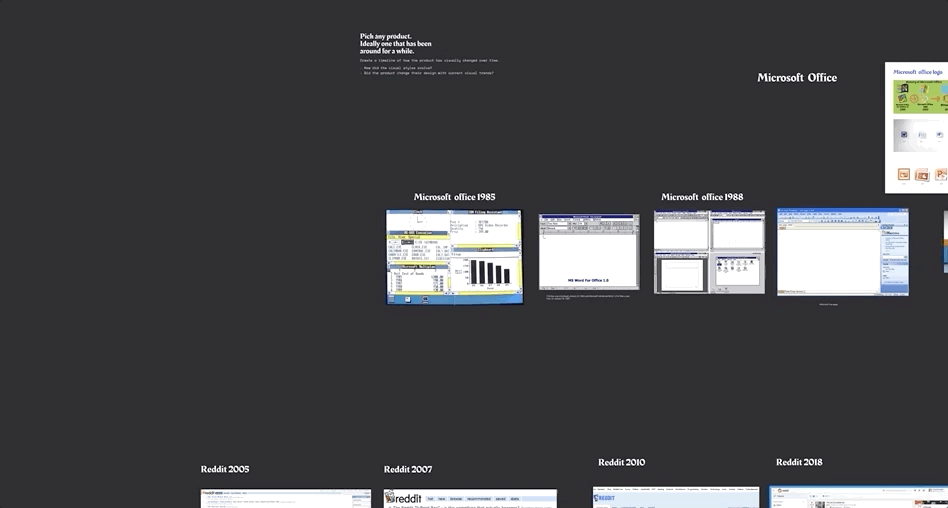
Each group shared their timeline with the class reflecting on the following questions:
- How did the visual style evolve over time?
- Did the product change its design with current visual design trends?
👀 Learning to see
I followed the history of UI lesson with one on finding & using inspiration. There is SO much design content everywhere, and it’s hard to understand how to pick inspiration. Picking something you “like” is fine, but picking something you like and understanding why you like it is better!
For this lesson, we began with a scavenger hunt 🕵️♀️. The goal was to think critically about why they like or dislike something. What works about this design? What could be improved? What elements do I want to take into my work?

We designed these prompts to encourage students to look at each design closely! After the scavenger hunt exercise, we placed the students in breakout rooms to find inspiration together. For each piece of inspiration, I had them list out pros and cons. What aspects of this design do you want to take into your work? What parts could use improvement 📈?

Our goal for this lesson was to encourage students to be inspired instead of duplicate. How can you find multiple sources of “good” inspiration and remix them to be your own?
🤔 How do you define good taste?
- How do you help students develop taste in your classroom?
- How can we balance teaching principles with trends?
- How do you ensure students maintain their visual voices?
- Who defines good taste and should we even abide to their standards?
Join the discussion and share your thoughts in this Figma file!