I've been working hard on the curriculum for "The art of visual design" and it's been challenging to fit my ambitious dreams into a digestible format. I've rewritten the syllabus at least 15 times 🥲 because this is the first time I feel 100% unconstrained, and there's actually a lot I want to say!
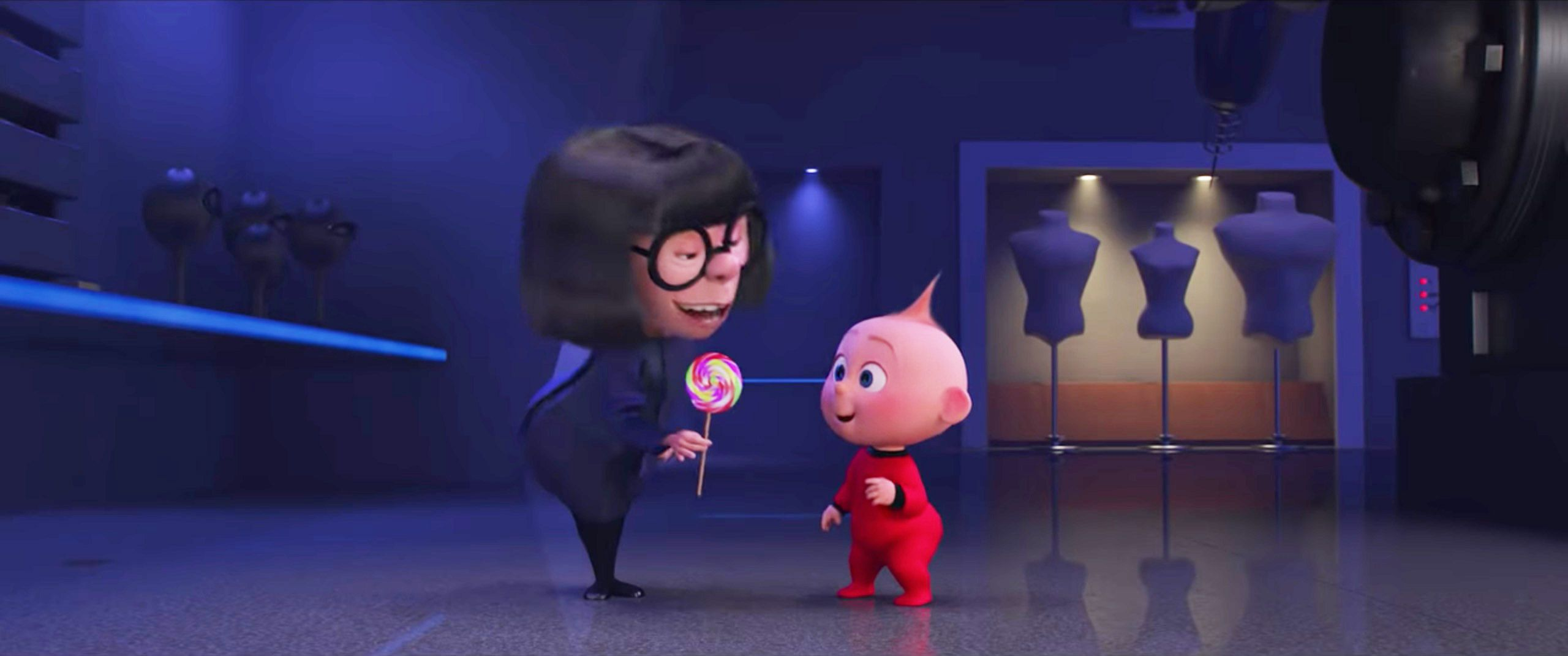
My goal is for the course to strike a balance between the practical and experimental. Looking at interface design education today, the options are either very practical online bootcamps or more theoretical university courses. You either learn the skills needed to "land your first UX job" or you learn about not-that-useful stuff like the Human Processor Model. Has anyone else taken a class with this image 💀?
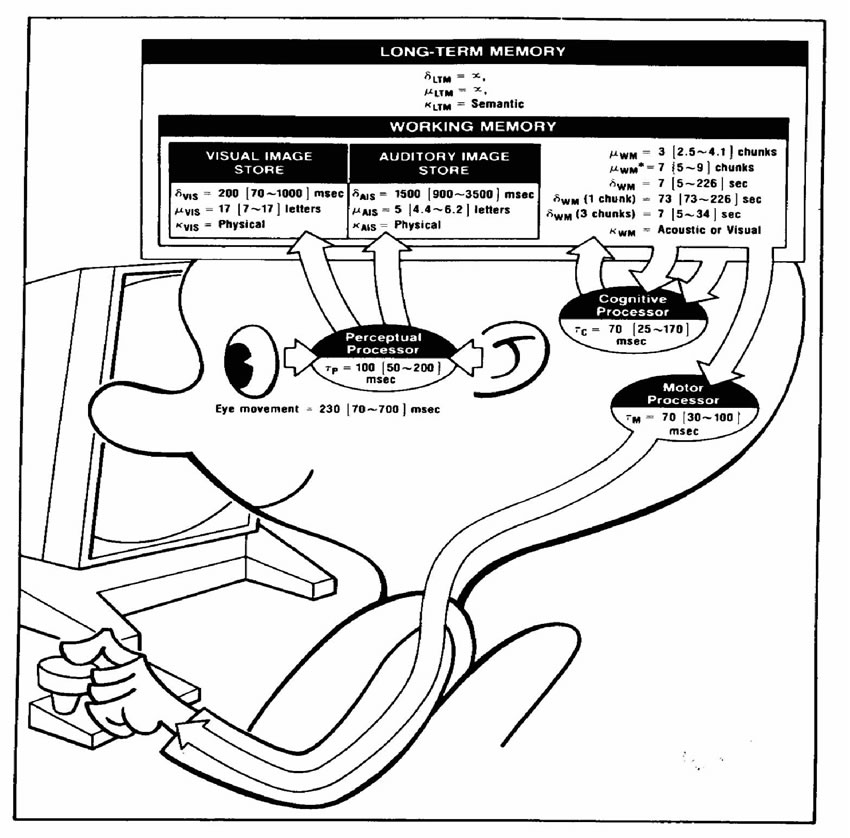
I remember learning about Fitt's Law in college and the takeaway was "the bigger the button is, the more likely the user will click on it." Instead of focusing on outdated research topics, I want to make space for critical discussions and experimental projects that question why modern interfaces look the way they do. I've been marinating on questions like:
- How can I teach a design course that appreciates and acknowledges the importance of the Bauhaus movement, but doesn't worship it?
- What design exercises and prompts can help us break out of the rigidity and sterility of modern UI design?
- What histories and people are lost within the design narrative? How can we collectively research and highlight these stories?
With these questions in mind, I decided to split the course into two parts: The rules and What rules? The idea is that I'll teach you all the rules, but just so you can break them later. I'm hopeful that by the end of the course, you'll have a refreshed and more optimistic view of what visual design can become!
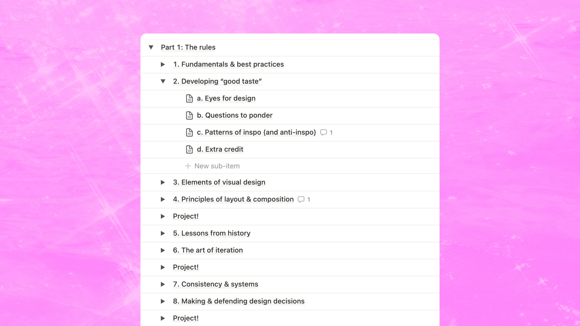
Part 1: The rules

The rules is focused on the traditional Eurocentric notion of good design: using utilitarian typography, aligning boxes to grids, and applying color meaningfully. These are the skills that set the foundation for your day-to-day design job. When I began planning this part, I listed everything I believed every visual designer should learn and identified these three foundational areas:
- Technique: How do you make your ideas come to life? Execution should not be a blocker to your ideas. If you have an idea in your head, you should be able to create it in your design tool of choice in an effective way.
- Taste: How do you know when something is considered good taste according to the industry? How can you cultivate your own aesthetic? When something feels off, can you articulate what's off about it?
- Tactics: What are the design standards that industry professionals abide by? What is the most methodical way to create a type hierarchy? When your design doesn't look good yet, what are strategies you can employ to improve it?
Many courses teach you a combination of (1) technique and (3) tactics but often fail to address (2) taste. From my experience, taste is the hardest area to incorporate because it is so subjective and nuanced. Being able to identify good industry taste comes from a place of privilege, yet it is oftentimes the deciding factor for a design position.
👀 Want a sneak peek?
Part 2: What rules?
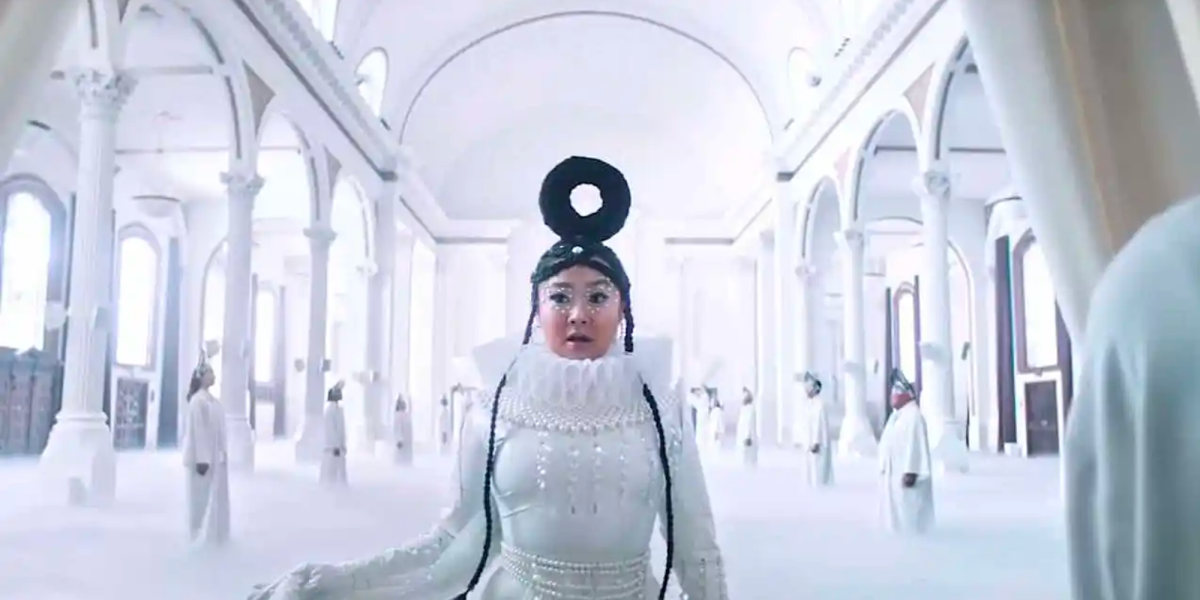
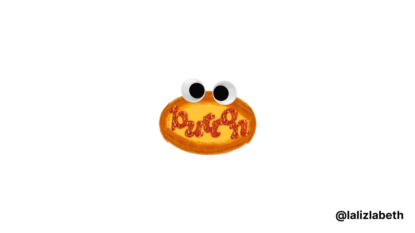
What rules? will be all about experimentation and breaking out of a rigid design mindset. Each module is filled with projects and exercises to help you explore more creatively. The current plan is to start with a module called "To all the design managers I loved before" where you get to do literally everything opposite of what every design leader has ever told you to do. (Like making buttons inspired by pizza:)
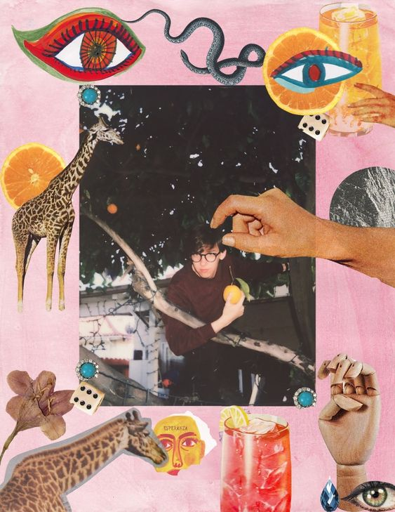
I'm particularly excited about a lesson called "Cut-out collage user interfaces." If you're a product designer, you may be familiar with the term design frankensteining 🧟♀️, the scary situation where you have to combine elements from old and new design systems together. Collage has historically been a popular medium in both art and graphic design. Today, the Y2K magazine cut-out collage aesthetic has made an internet resurgence. But what does the interface version of cut-out collages look like? What happens when you have to use 10 different design systems to create a comprehensive design?
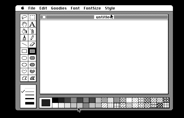
What rules? has been especially fun for me to develop because I've been diving deep into rabbit holes and keep stumbling upon pretty cool (and distracting) gems on the internet. Like this MacPaint emulator for example which I will most certainly use as a constraint for a project. I don't have a comprehensive outline of part 2 to share yet, but am excited to continue developing it.
That's all (for now)!

It's all a work in progress, but the goal is to start the beta in less than 2 weeks! I can't wait to share everything with you all 💖
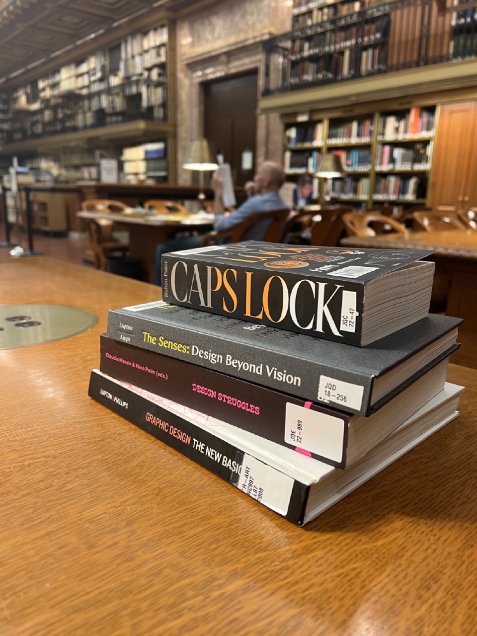
P.S. If you're in New York, did you know you can reserve design books for use at the Art & Architecture research room in the NYPL's Rose Room? I've been spending a lot of time there and the space is wonderful. The books are also in amazing condition because you can only use them on site!